The Design Process
I initially used Adobe Illustrator since I'm more familiar with the software, but soon realized I knew much less that I thought! I switched over to Rhino, and benefited greatly from the collective knowledge of my colleagues. I spent many hours cutting prototypes out of index cards to see if the pieces would stack both horizontally and vertically.
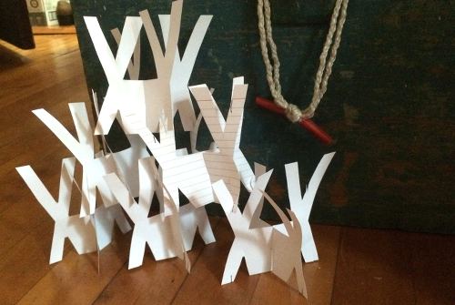
An initial prototype out of index cards
Finally, once I mirrored the "X" design, I was able to build my divider. But, the interlocking slots were first too tight, and then too loose, so many more hours went into adjusting and reprinting. Finally, with a snug fit, the pieces could be easily assembled, so I added chamfers to the design.
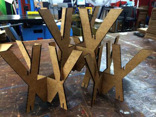
A working prototype without chamfers
I schlepped the stacks of cardboard pieces (the design includes two similar pieces that slide together), and assembled very carefully. I had to be very precise because any tilted pieces caused the entire divider to be slanted.
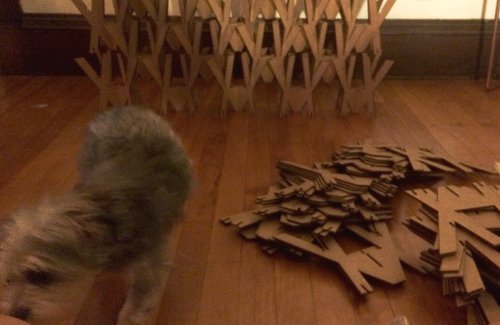
Mika attempting to help me build
Finally! The room divider can now be easily transported. For now, it holds a very important role in my room in keeping my nosy dog out of trouble. Mika has zero interest in knocking it over, as it stands a bit over 5 feet tall.
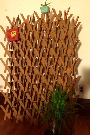
Final assembled room divider
If I had more time, I would improve the shape of the X so that student work could be tacked onto each piece easily, or I would build the entire divider out of sturdier material so that it can last multiple uses.

Close-up of interlocking pieces
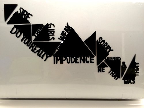
Macbook Skin
For my experiment with the vinyl cutter, I used a quote from one of my 5th grade student's novel. It says: "Sire, do you really think girls are that weak? Impudence! He whispered, 'I'm sorry!' And that was that." It's a quote that reminds me of some awesome memories with my student, so it seems fitting that I feature it on my laptop during my time at Harvard and MIT. Surprisingly, the process was very simple and I ran into no troubles. I freehanded the design, traced and scanned into Illustrator, and then I touched up the image carefully. Though time-consuming, the printing and transfer process went quite smoothly!
