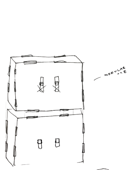
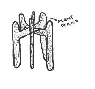
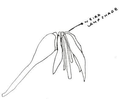
week two started out with a bang (not least because i started on the
waitlist!) but also because we began with an orientation joints and joinery,
looking at different methods of combining materials and debating their advantages
and disadvantages.
the assignment this week was to build a friction-fit cardboard object using the
lasercutter and also to produce a vinyl-cut design, but ALSO to build a website
to showcase our work and discuss the challenges.
we work on a single repo on gitlab with the rest of the class, and for me this was
a first foray into web-building. i have lots of questions and lots to learn.
but, back to design! like last week, i started with pen and paper.


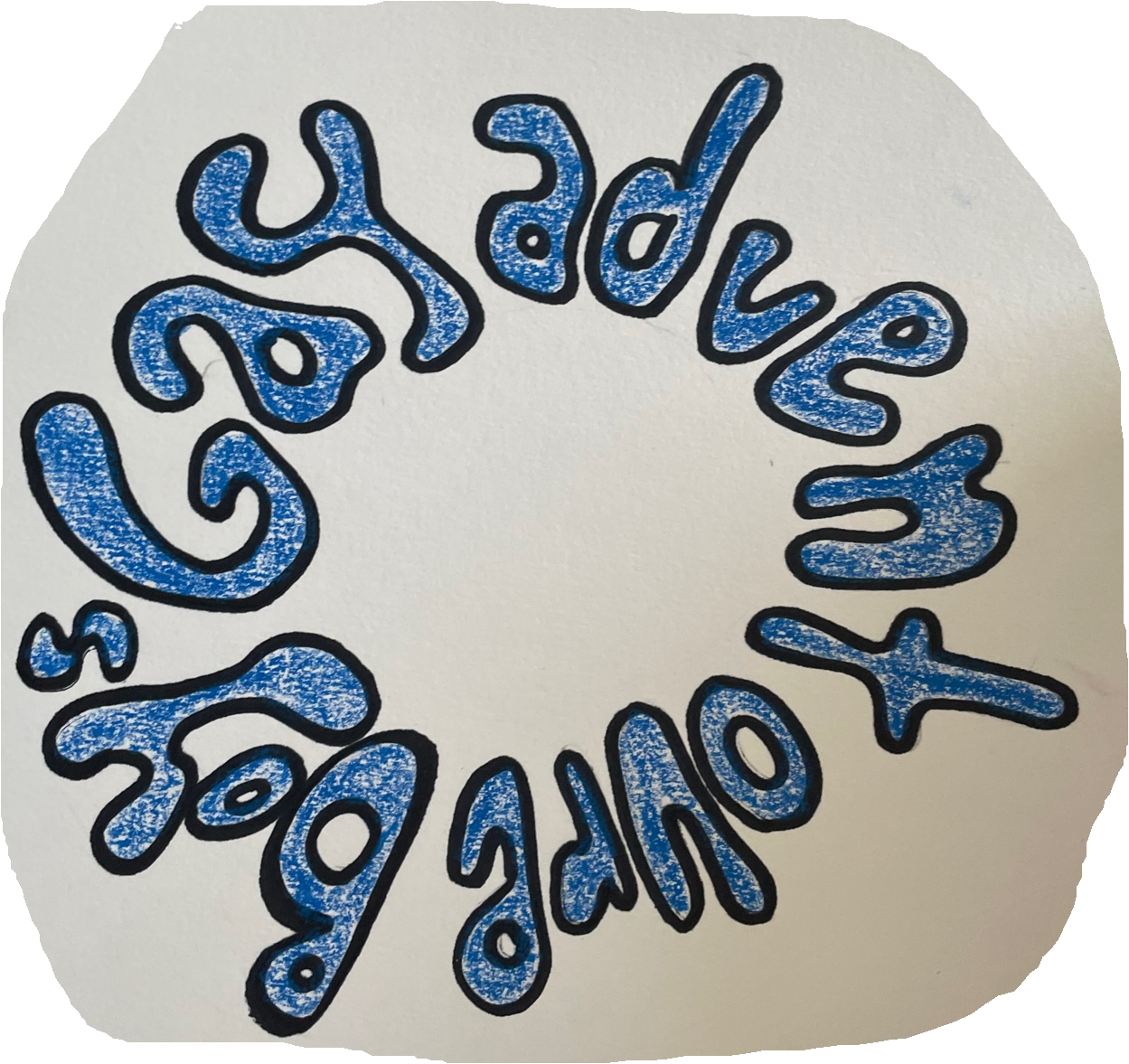
vinyl sketch credit to leni haass
i decided to design and build a lamp shade, since my apartment has some terrible overhead lighting. although i wanted to make it very weird and organic looking. when i started mocking it up, i realized that i needed some extra support to make sure that the leaves didn't fall off, so i started with only one leaf and mocked up a tab system that could fit inside the t-joints.
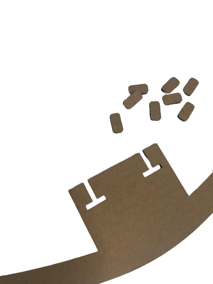
the tiny tab has the width of the hypotenuse of the t-joints as its width so
that it can be slid in and still be twisted into position to
bind the connection firmly.
the harvard labs use illustrator as their print-manager and it took me a little
bit of time to get a hang of it (i would love to be a good illustrator user, but
i'm not). once i got printing sorted, it took a few experimental prints, even
after measuring the cardboard carefully and including kerf reductions, to get a
perfect fit on the pieces.
some notes here: illustrator likes sketches not arrangements, sadly!
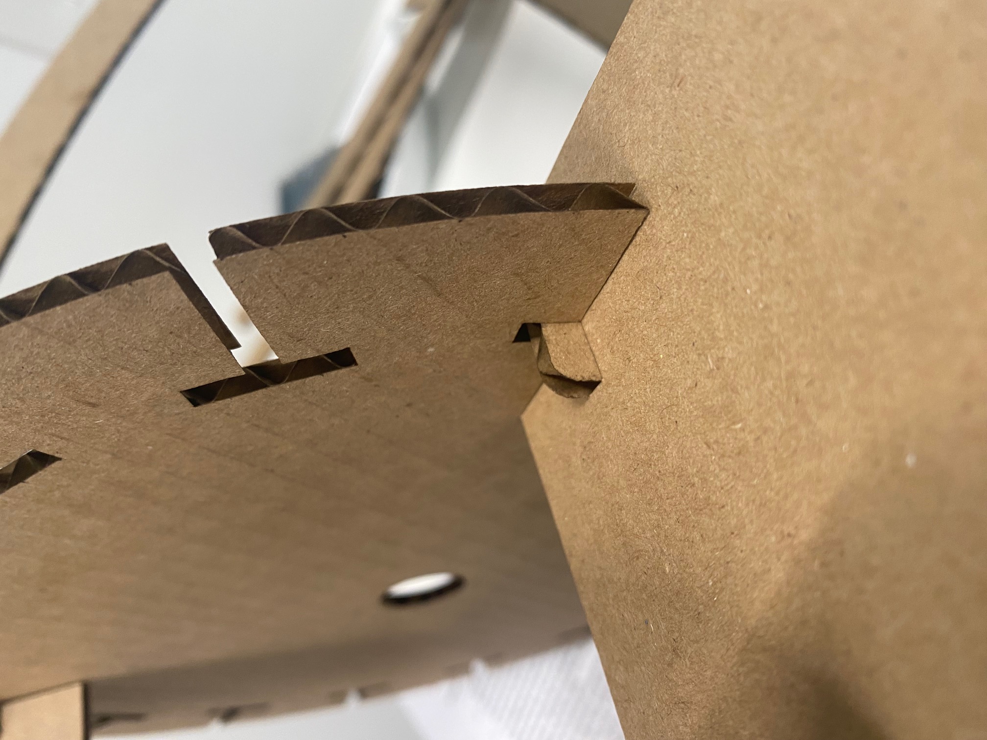
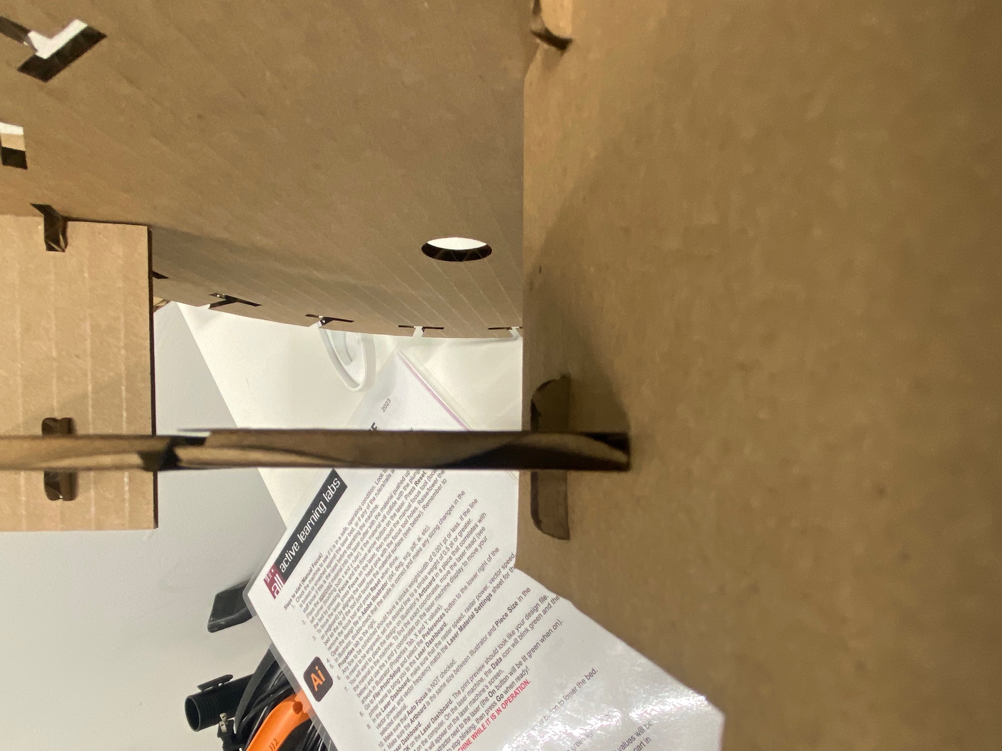
initially, things didn't fit together perfectly, but soon it was all fitting
quite snugly.
in the end, out of mostly laziness & time constraint, i decided to go with one
profile for the leaves although i think it would have looked better if it was
more wild, strange, and organic.
download the cad file!
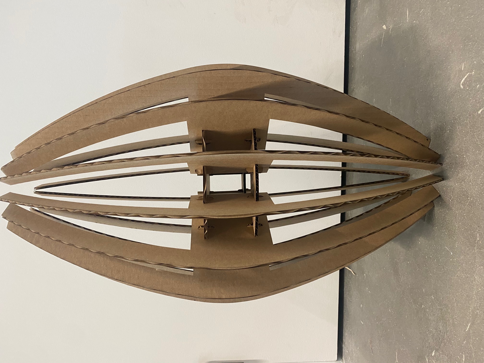
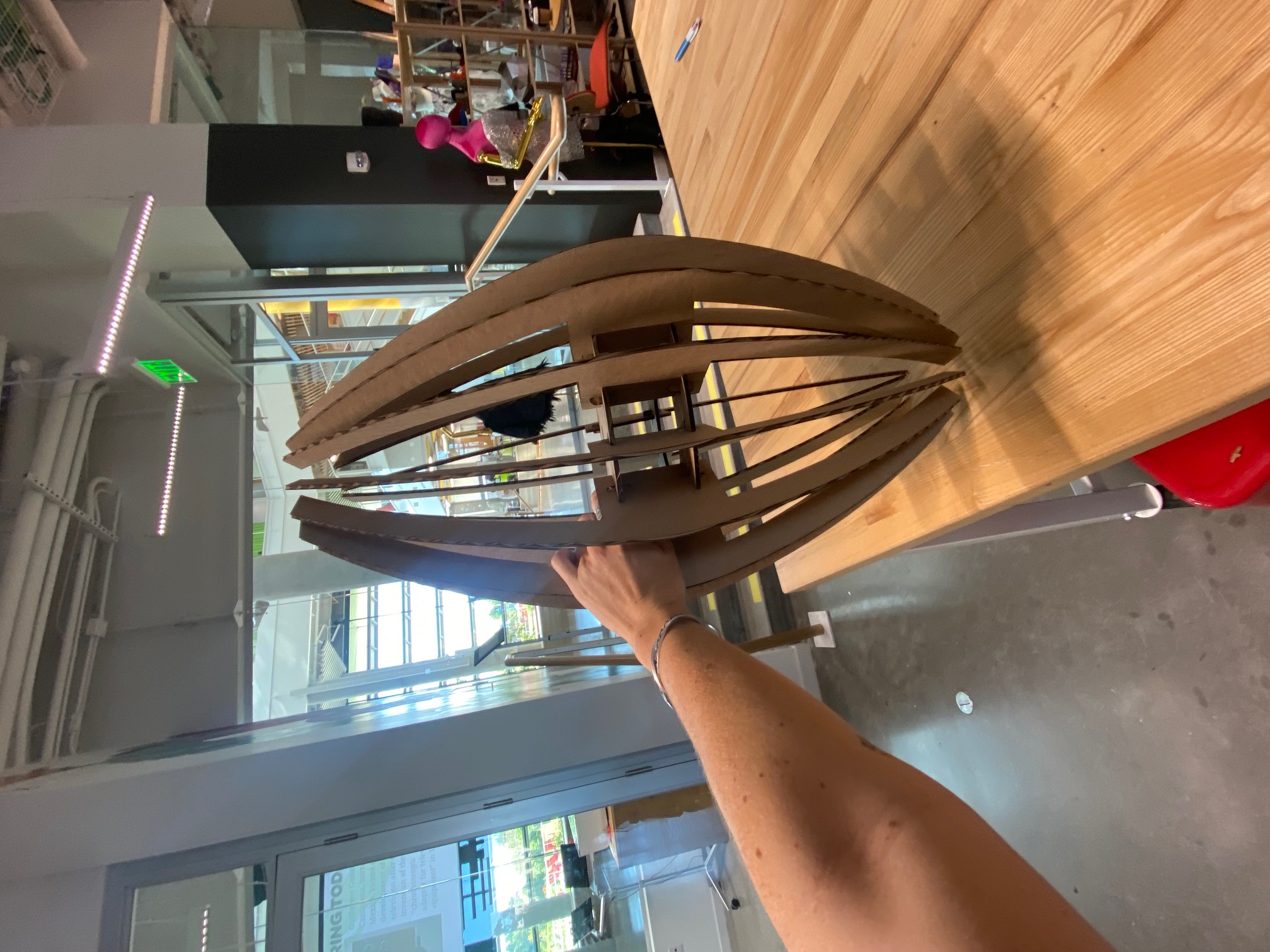
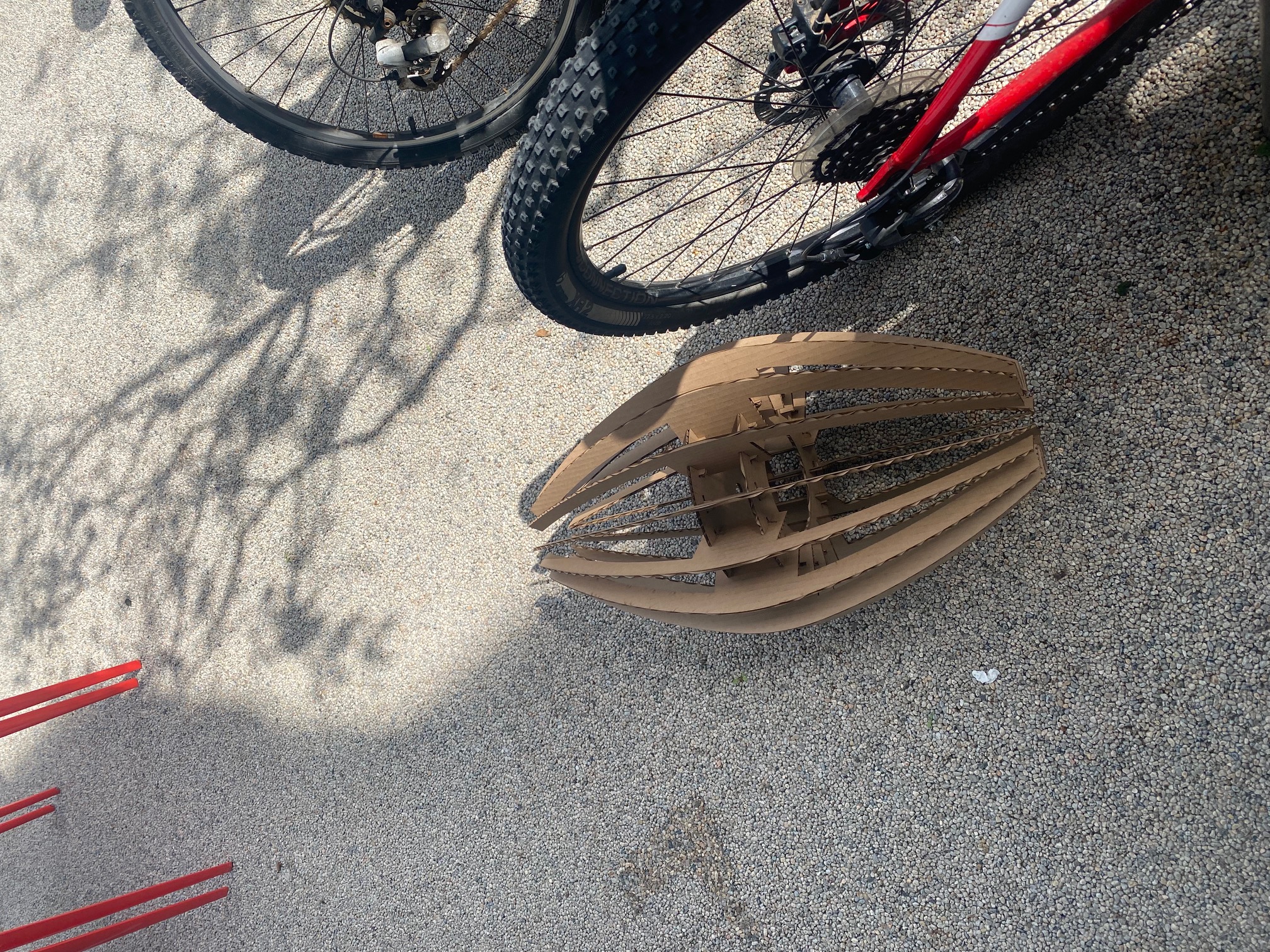
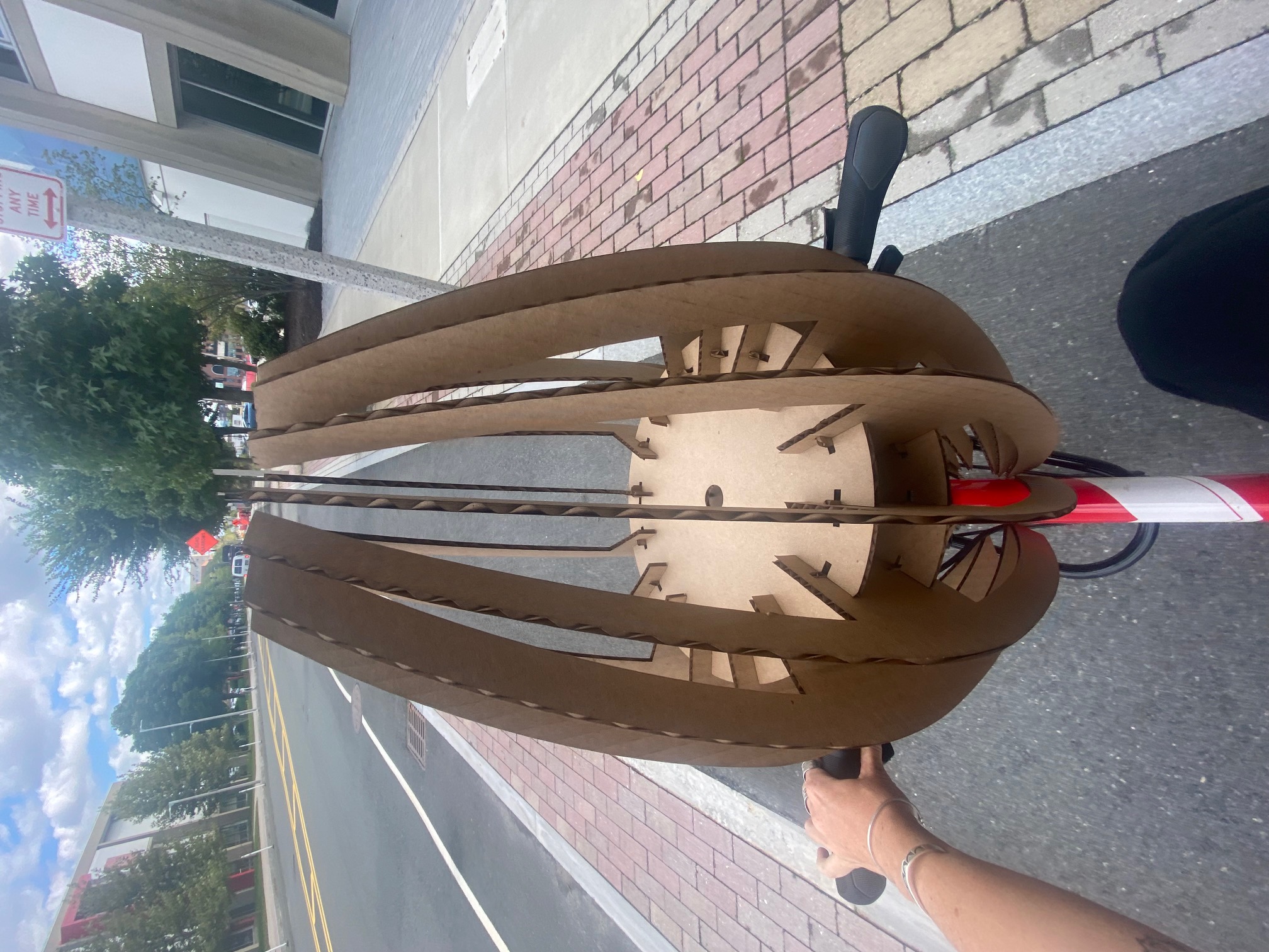
after assembly, it was shockingly sturdy, surviving a tumble and a ride down memorial drive without any discernible damage...
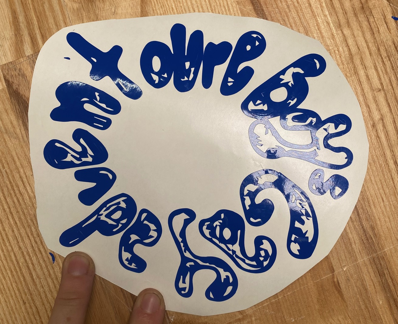
the vinyl cut came out quite nicely with some interesting (but desirable) oddities in rastering from the hand-colored in pencil shading on the lettering
and that is *all* for week 2...