Usability
What is Usability?
usability: extent to which a system, product or service can be used by specified goals with effectiveness, efficiency and satisfaction in a specified context of use. (ISO 9241-11)
- effectiveness: the accuracy and completeness with which specified users can achieve specified goals in particular environments
- efficiency: the resources expended in relation to the accuracy and completeness of goals achieved
- satisfaction: the comfort and acceptability of the work system to its users and other people affected by its use
Usability Standards
Methods to support human-centered design, Martin Maguire
ISO 9241 Ergonomics and Human Computer Interaction
ISO 13407 Human-centred design processes for interactive systems (old)
ISO 9241-210Human-centred design processes for interactive systems (new)
Guiding principles:
- The design is based upon an explicit understanding of users, tasks, and environments.
- Users are involved throughout design and development.
- The design is driven and refined by user-centered evaluation.
- The process is iterative.
- The design addresses the whole user experience.
- The design team includes multidisciplinary skills and perspectives.
HCI
The Eight Golden Rules of Interface Design Ben Shneiderman (1985)
- Strive for consistency.
- Seek universal usability.
- Offer informative feedback.
- Design dialogs to yield closure.
- Prevent errors.
- Permit easy reversal of actions.
- Keep users in control.
- Reduce short-term memory load.
Usability Heuristics - Jacob Nielsen (1994, 2005)
- Visibility of System Status
- Match Between the System and the Real World
- User Control and Freedom
- Consistency and Standards
- Error Prevention
- Recognition Rather than Recall
- Flexibility and Efficiency of Use
- Aesthetic and Minimalist Design
- Help Users Recognize, Diagnose, and Recover from Errors
- Help and Documentation
Usability goals:
- Learnability
- Efficiency
- Memorability
- Errors (as in low error rate)
- Satisfaction
User Testing
Guides from the Nielson Norman Group:
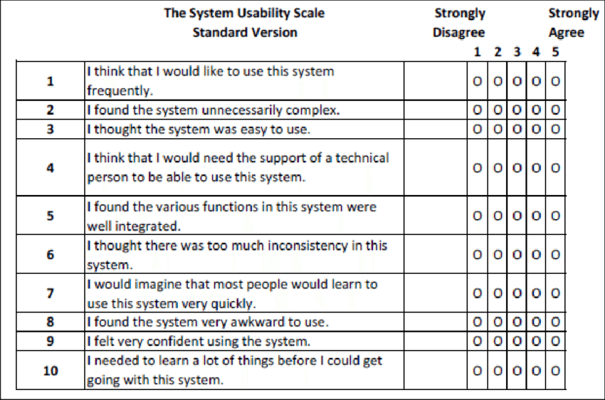
System Usability Scale (SUS)
- SUS by John Brooke 1986
Usability of machine tools
- combination of HCI and hardware
- Human Factors Ergonomics (HFE) and HCI need to be considered
- Consider the users you are designing the machines for (UX design)
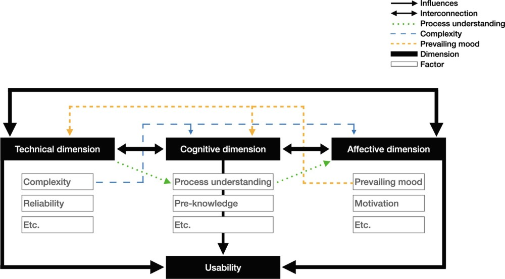
Physical, Cognitive and Affective Impacts
Usability of open source machine tools, Lange et al. (2024)
Anxiety and fear of machine tools
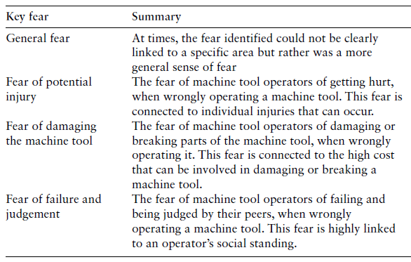
Further research on anxiety and fear
Social cognitive theory Albert Bandura 1999
Consumer orinetation through Kansei engineering
Kansei Eingineering for machine tools
Whirlwind History of HCI (Human-Computer Interaction)
(from 2021 lecture)
1953:
As We May Think It, Vaneever Bush
1960:
Man-Computer Symbiosis, J. C. R. Licklider
1963: Sketchpad, Ivan Sutherland
Ivan Sutherland's PhD Thesis for which he later recieved the Turing Award and the Kyoto Prize. It was the first program with a complete graphical user interface and the first CAD program.
1968:
Mother of All Demos, Douglas Engelbart
Presentation of oN-Line System (NLS) which was inspired by Sketchpad. Demonstrated windows, hypertext, graphics, efficient navigation, command input, video conferencing, the computer mouse, word processing, dynamic file linking, revision control, and collaborative real-time editing. Basically everything that became the modern personal computer.
1971: Design for The Real World
“There are professions more harmful than industrial design, but only a few of them. And possibly only one profession is phonier. Advertising design, in persuading people to buy things they don’t need, with money they don’t have, in order to impress other who don’t care……Never before in history have grown men sat down and seriously designed electric hairbrushes, rhinestone-covered file boxes, and mink carpeting for bathrooms, and then drawn up elaborate plans to make and sell these gadgets to millions of people.”
- Methods: The interaction of tools, processes, and materials. An honest and optimal use of materials. Example: Dow Chemical’s ‘self-generating’ Styrofoam dome.
- Use: ‘Does it work?’ Example: A vitamin bottle should dispense pills singly.
- Need: Much design has satisfied only evanescent wants and desires while the genuine needs of man have often been neglected by the designers. The economic, psychological, spiritual, technological, and intellectual needs of a human being are usually more difficult and less profitable to satisfy than the carefully engineered and manipulated ‘wants’ inculcated by fad and fashion. Example: To prevent food from perishing in Third World countries.
- Thesis: ‘The deliberate, purposeful utilization of the processes of nature and society to obtain particular goals’. The content of a design must reflect the times and conditions that have given rise to it, and must fit in with the general human socio-economic order in which it is to operate. Example: Americans who try to couple a Japanese interior with an American living experience in their search for exotica find that many elements cannot be ripped out of their context.
- Association: Our psychological conditioning, often going back to earliest childhood memories, comes into play and provides us with antipathy against a given value. Example: what shape is most appropriate to a vitamin bottle: a candy jar, a perfume bottle or a style salt shaker?
- Aesthetics: A tool that helps in shaping design. However, there is no yardstick for the analysis of aesthetics. Thus, it is simply considered to be a personal expression fraught with mystery and surrounded with nonsense.
1980:
Do Artifacts Have Politics?, Langdon Winner
Yes he says and he suggests two considerations:
"yes or no" on whether to adopt a new technology and
"special features in the design or arrangement of a technical system" for which the answer to the first choice was "yes." The most important thing to recognize about these choices is that they often go far being pragmatic concerns about what tool would be best or most cost-effective for a given job. Many amount to the selection of "forms of life," since they embody certain possibilities more than others. The "greatest latitude of choice exists the very first time a particular instrument, system, or technique is introduced," so "the same careful attention that one would give to the rules, roles, and relationships of politics must also be given" to such technological choices.
1983:
Psychology of Human-Computer Interaction, Stuart Card, Thomas P. Moran, Alan Newell
1983:
Visual Display of Quantitative Information, Edward Tufte
Seminal text on information visualization.
1983:
Direct Manipulation: A Step Beyond Programming Languages, Ben Shneiderman
- continuous representation of the objects and actions
- rapid, incremental, and reversible actions
- physical actions and gestures to replace typed commands, which enabled designers to craft more effective graphical user interfaces
The Eight Golden Rules of Interface Design
-
Strive for consistency. Consistent sequences of actions should be required in similar situations; identical terminology should be used in prompts, menus, and help screens; and consistent color, layout, capitalization, fonts, and so on, should be employed throughout. Exceptions, such as required confirmation of the delete command or no echoing of passwords, should be comprehensible and limited in number.
-
Seek universal usability. Recognize the needs of diverse users and design for plasticity, facilitating transformation of content. Novice to expert differences, age ranges, disabilities, international variations, and technological diversity each enrich the spectrum of requirements that guides design. Adding features for novices, such as explanations, and features for experts, such as shortcuts and faster pacing, enriches the interface design and improves perceived quality.
-
Offer informative feedback. For every user action, there should be an interface feedback. For frequent and minor actions, the response can be modest, whereas for infrequent and major actions, the response should be more substantial. Visual presentation of the objects of interest provides a convenient environment for showing changes explicitly.
-
Design dialogs to yield closure. Sequences of actions should be organized into groups with a beginning, middle, and end. Informative feedback at the completion of a group of actions gives users the satisfaction of accomplishment, a sense of relief, a signal to drop contingency plans from their minds, and an indicator to prepare for the next group of actions. For example, e-commerce websites move users from selecting products to the checkout, ending with a clear confirmation page that completes the transaction.
-
Prevent errors. As much as possible, design the interface so that users cannot make serious errors; for example, gray out menu items that are not appropriate and do not allow alphabetic characters in numeric entry fields. If users make an error, the interface should offer simple, constructive, and specific instructions for recovery. For example, users should not have to retype an entire name-address form if they enter an invalid zip code but rather should be guided to repair only the faulty part. Erroneous actions should leave the interface state unchanged, or the interface should give instructions about restoring the state.
-
Permit easy reversal of actions. As much as possible, actions should be reversible. This feature relieves anxiety, since users know that errors can be undone, and encourages exploration of unfamiliar options. The units of reversibility may be a single action, a data-entry task, or a complete group of actions, such as entry of a name-address block.
-
Keep users in control. Experienced users strongly desire the sense that they are in charge of the interface and that the interface responds to their actions. They don’t want surprises or changes in familiar behavior, and they are annoyed by tedious data-entry sequences, difficulty in obtaining necessary information, and inability to produce their desired result.
-
Reduce short-term memory load. Humans’ limited capacity for information processing in short-term memory (the rule of thumb is that people can remember “seven plus or minus two chunks” of information) requires that designers avoid interfaces in which users must remember information from one display and then use that information on another display. It means that cellphones should not require reentry of phone numbers, website locations should remain visible, and lengthy forms should be compacted to fit a single display.
These underlying principles must be interpreted, refined, and extended for each environment. They have their limitations, but they provide a good starting point for mobile, desktop, and web designers. The principles presented in the ensuing sections focus on increasing users’ productivity by providing simplified data-entry procedures, comprehensible displays, and rapid informative feedback to increase feelings of competence, mastery, and control over the system.
1988:
Design of Everyday Things, Don Norman
7 principals of design:
-
Discoverability. It is possible to determine what actions are possible and the current state of the device.
-
Feedback. There is full and continuous information about the results of actions and the current state of the product or service. After an action has been executed, it is easy to determine the new state.
-
Conceptual model. The design projects all the information needed to create a good conceptual model of the system, leading to understanding and a feeling of control. The conceptual model enhances both discoverability and evaluation of results.
-
Affordances. The proper affordances exist to make the desired actions possible. The object suggests its use.
-
Signifiers. A signifier communicates where an action should take place. Effective use of signifiers ensures discoverability and that the feedback is well communicated and intelligible.
-
Mappings. The relationship between controls and their actions follows the principles of good mapping, enhanced as much as possible through spatial layout and temporal contiguity.
-
Constraints. Providing physical, logical, semantic, and cultural constraints guides actions and eases interpretation.
1997:
Towards Accessible Human-Computer Interaction, Johnson Bergman
"Providing accessibility means removing barriers that prevent people with disabilities from participating in substantial life activities, including the use of services, products, and information."
2000:
Tools for Thought, Howard Rheingold
Exploring where "mind-amplifying technology" comes from.