Week 2: Press Fit Construction Kit
This week’s assignment was to create a press fit construction kit. This was meant to be done using the laser cutter on cardboard, or vinyl cutter using some other material. Because I have experience making a press fit kit out of cardboard using a laser cutter, from a project from last semester, I decided to take this project in a different direction after first demonstrating my use of a laser cutter on cardboard.
For the cardboard press fit kit, I made clouds, rainbows, and raindrops. I thought they were cute. The first thing I did was make a key for determining how wide the notches should be in the cardboard. I made one slot I thought would be too large, then patterned it such that every subsequent slot was 95% smaller than the previous one. I've found that the measurements don't always line up as expected - probably differences with Illustrator files translate to .svg to CorelDraw, etc. What really matters is that the value, in whatever units, I put into Illustrator comes out as the real world width I want. But I think if I were laser cutting these things regularly, I'd spend time figuring out how to get the value I put into Illustrator be the one that comes out of the laser cutter. Right now, I just do slot by slot. The keys helped me see the ideal slot width, but also gave an indication of tolerance. For corrugated (and highly deformable) cardboard, there is a large tolerance.
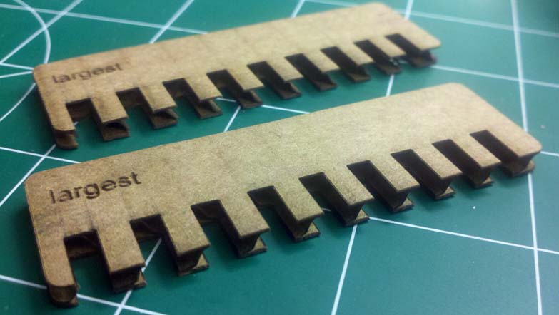
Two keys for determining slot width
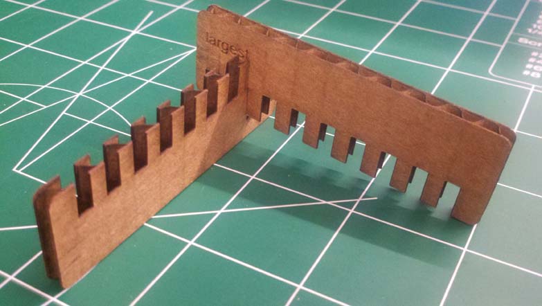
Interlocking shows correct width
I have found that it’s best to try everything out at least once before making the final project. That means – on the material you want to use, with all the software you want to use, in the units you intend to use. For this I used Illustrator, which I’ve been meaning to learn.
After that I just made all the shapes (with help from my labmate Taylor, an Illustrator wiz) and cut them out using 60% speed and 40% power. The cardboard has a range of values for cutting. But I found that since it bows, to tweak the settings to something lighter (higher speed, less power) means not all the shapes get cut out. I went on the strong side so I wouldn’t have to cut multiple times. I chose to only have slots on the top of raindrops and bottom of rainbows, so there were never any exposed slots, which I don't think look very good.
The final products looked like this:
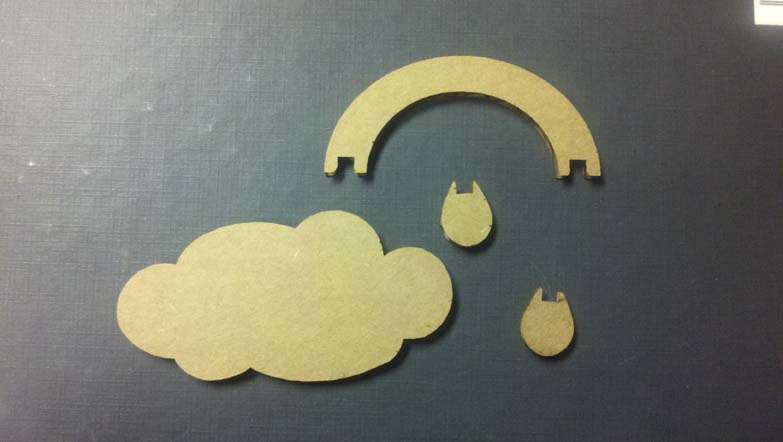
Pieces laid out
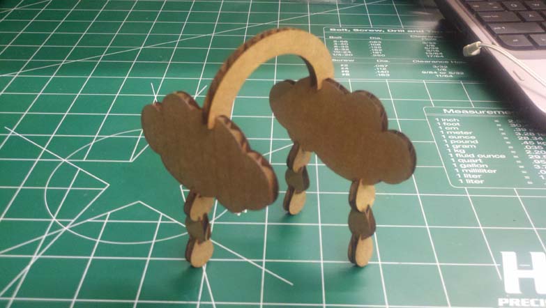
Cardboard pieces assembled
Then onto the bigger project: wood panels. I am taking this class to advance my skills, and since I already know how to use a laser cutter, I thought I’d spend this week getting better with Illustrator and Photoshop, and honing my calibration skills on the laser cutter (i.e. determining power and speed settings for new materials) I was short on time, so I didn’t get to try everything out that I wanted to, but I did a lot that I’m proud of.
The idea of small panels was appealing to me, though I’m not sure why or what their eventual utility is. Growing up, my house had these rice paper panels separating two rooms. And I took inspiration from them, that they’d have a cherry blossom pattern. Initially, I wanted pieces that connect the panels to one another (but articulate so you can arrange the panels however you want) but because of time, I just made feet for them.
I got an image of cherry blossoms online and used Photoshop to convert it to black and white. I then opened it in Illustrator, which had the panel’s outside profile and mask to make the cherry pattern only within the inlay. This took about an hour, with help from a labmate.
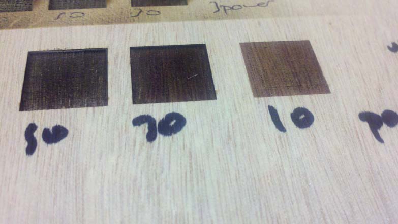
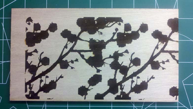
For materials, I got 1/4" Okoume plywood from Boulter Plywood in Somerville, because a labmate of mine used it for a lamp he made, and it’s quite lovely. I highly recommend the store. Okoume is marine grade plywood, so it doesn’t have the voids and warps regular plywood does, making it ideal for etching. I first did tests for the speed and power I should use to cut through and to etch the plywood. I ended up using 30% speed and 60% power for cutting through, and (with blue painter’s tape for masking), 60% speed and 17% power for etching.
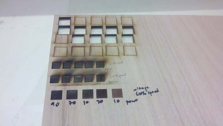
Arrays of tests for cutting through and etching
Etching test up close
A 10% power left a nicer color (not as dark), but it didn’t entirely burn away the adhesive, so the plywood was still sticky. A 15% power couldn’t get off the tape at the seams (where they were overlaid due to my less-than-perfect maksing). 20% seemed too dark.
60% speed, 20% power
60% speed, 10% power
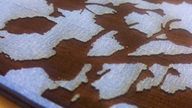
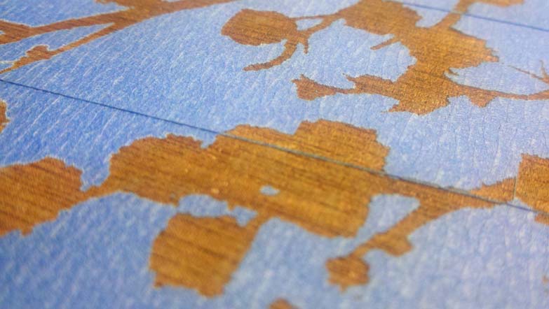
I spraypainted one side of each panel, then masked both sides with painter’s tape. I etched both sides then spray painted the side without paint. I did this intending to have the design and its negative on each panel, but it didn't work out as planned, which will be discussed later. I had a lot of trouble centering the image, and setting the origin correctly. I normally would have cut out the panel when I etched it (easier to center), but because I was spray painting, I thought it would be easier to cut out, paint, then etch the image. But eventually I got it right.
Centering: the eternal struggle
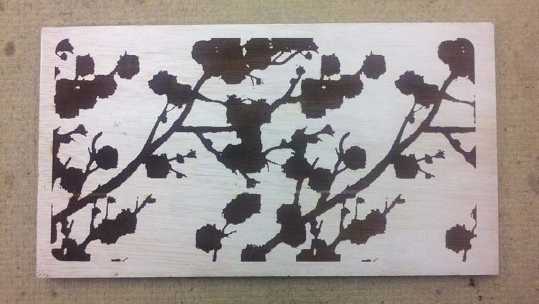
Better!
I chose red/orange, gold, and white. This was primarily because they were available in the Product Design Lab (PDL), and they seemed to go together well. I also made one without any paint. Last of all I made the feet, since I didn’t know how the paint would affect their thickness. I colored them to match the panels, until I ran out of white paint.

Three of the colored panels
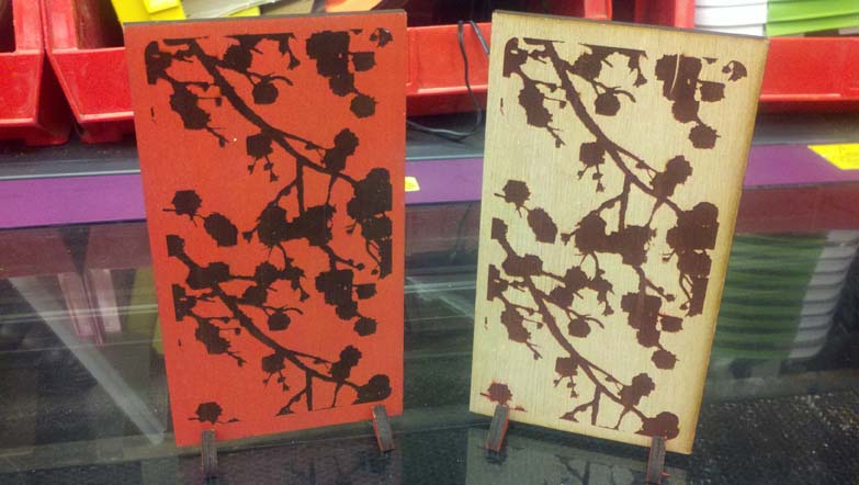
Red panel front and back
Unfortunately, these panels were characterized by shortness of time. I started late and didn’t have as much access to the laser cutter as I thought I would (you know, sharing and all). If I did it again, I’d make several changes. First, I’d sand beforehand and let the paint dry for longer. I also would have put a border around the etched pattern (I prefer it stylistically) and etched when I cut the pattern so I could assure they were centered. Also, instead of having one pattern and changing when the spray paint is applied, I would (in Photoshop) make the original pattern plus its negative, and do all spray painting beforehand, and all paint is etched away. Nonw is applied to an etched surface. I thought the two panel sides would be negatives, but because the paint is being applied to the outer veneer in one case, and the etched strata in the second case, these colors are not the same. I saw the panels in my mind, but I didn't translate that well to my process.
Overall, I’m proud of my work. I’m glad I got to practice more with the Adobe products and with the laser cutter, which I access using CorelDraw and Windows. Hopefully the lessons I learned here will help me avoid the pitfalls when etching an image matters, and I can’t do it several times.
Files Used
- Files for press fit
- Files for Etched panels