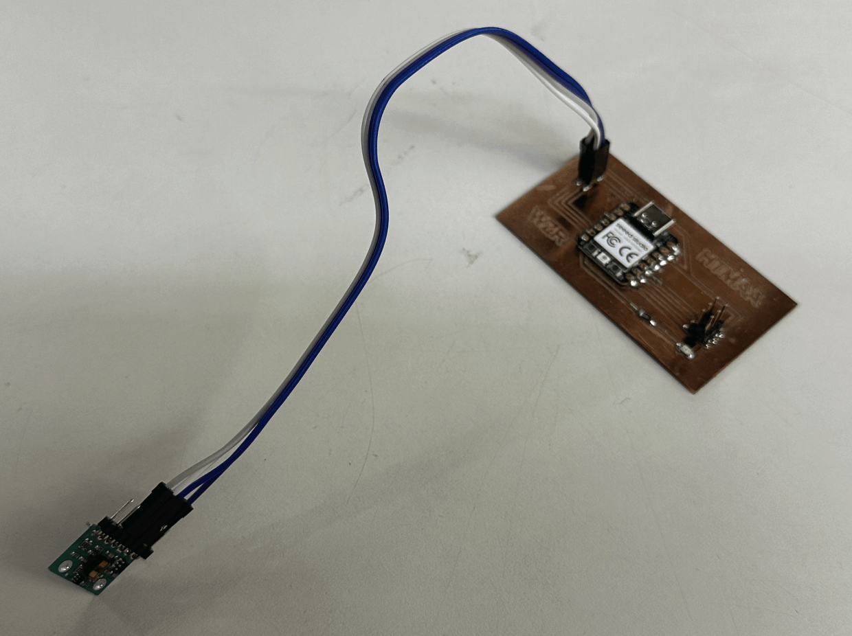
From my input device week, I chose the VL53L1X module for distance sensing. For this exercise, I am only using this device to extract the distance data and send it back to my mac.
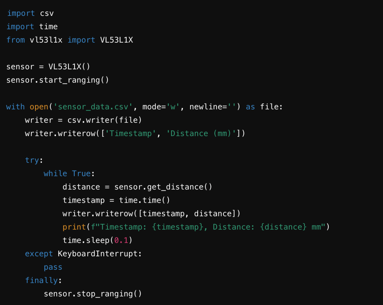
I am only generating "distance", and "timestamp"(per second) for my data analysis' material.
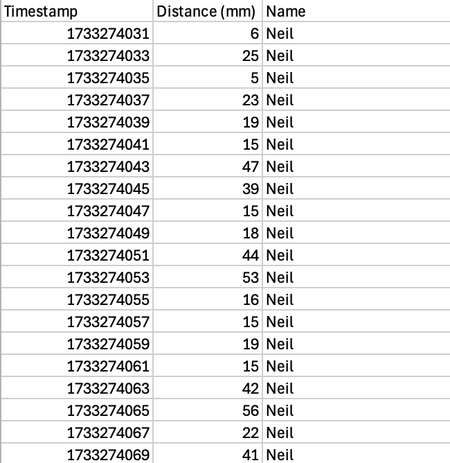
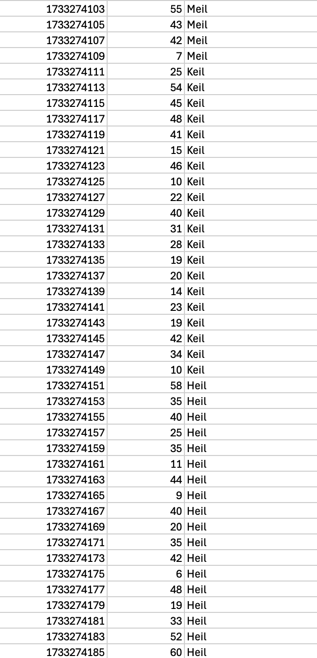
This is a sample of data extracted from the device. The name column was added manually as a record.
My goal is to test out a multiuser's scenario and see how can the data intersect to each other in my application. To test this out faster, I called my friend ChatGPT to generate other four random user's data (20 data each, within similar range).
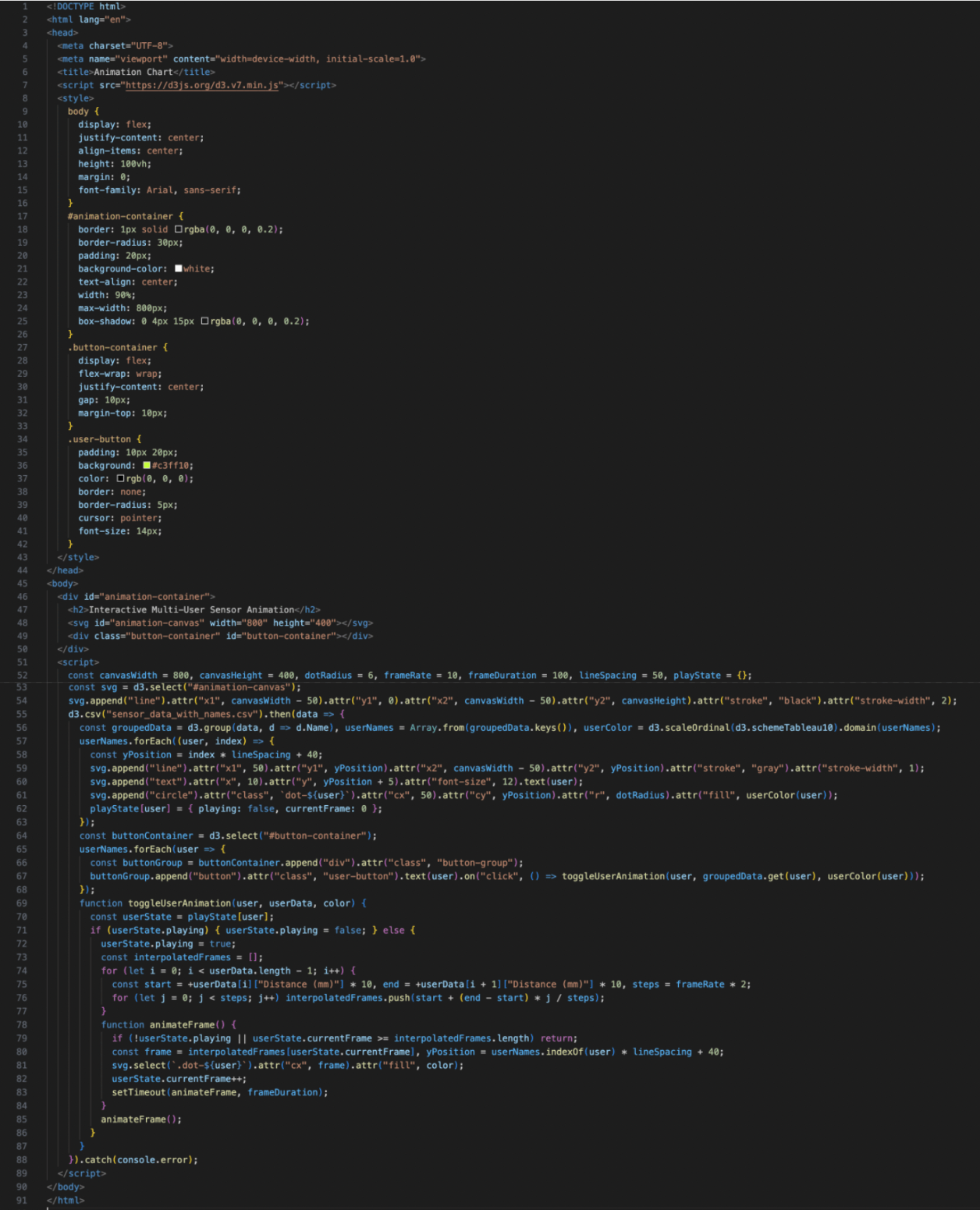
Base on my material's feature (csv file), I chose the D3.js (Data-Driven Documents) Javascript library to create dynamic and interactive data visualizations. The reason why I am choosing this library is based on these reasons:
1. Unlike many libraries with predefined chart types (e.g., Chart.js, Highcharts), D3.js provides low-level control over every aspect of a visualization. This makes it ideal for creating custom visualizations
2. D3.js has an extensive community, abundant tutorials, and open-source extensions. It’s easier to find resources and inspiration for building innovative visualizations.
My goal is to fully explore and test out how different tools and visualize the data!
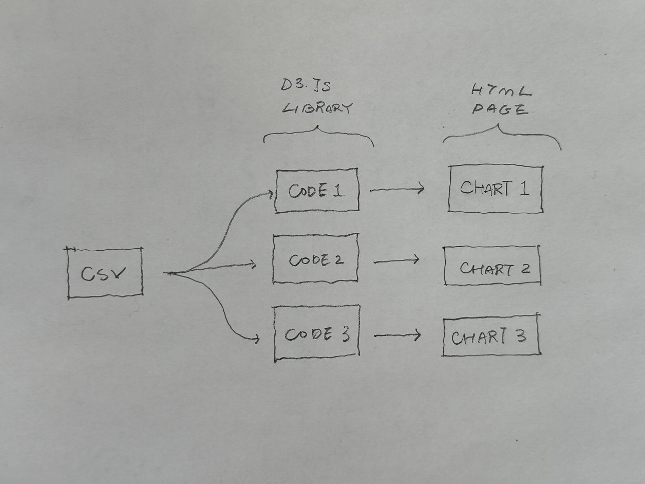
The html (output) that I am working is all based on this simple data structure showing on the right. All the charts are generated by one CSV file with different codes. My goal is to write this flexible structure so that when I replace the CSV file each time, all the charts can be updated accordingly.
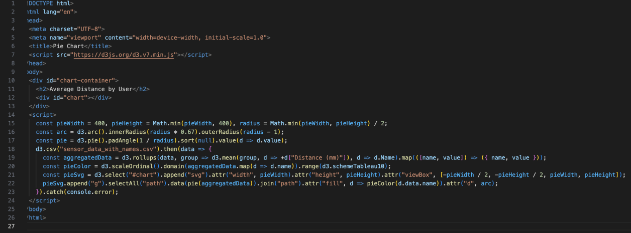
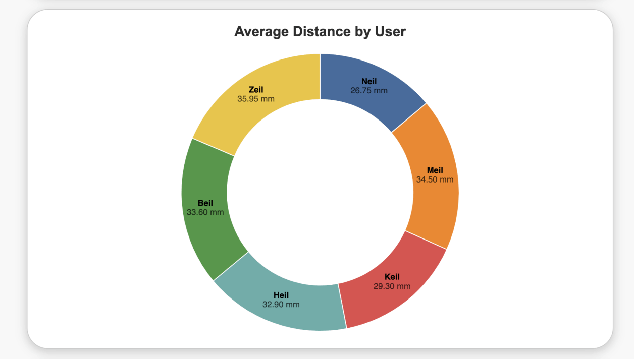
The first code is making a pie chart that summarized the user's name and the average distance detection within the 20 tests.
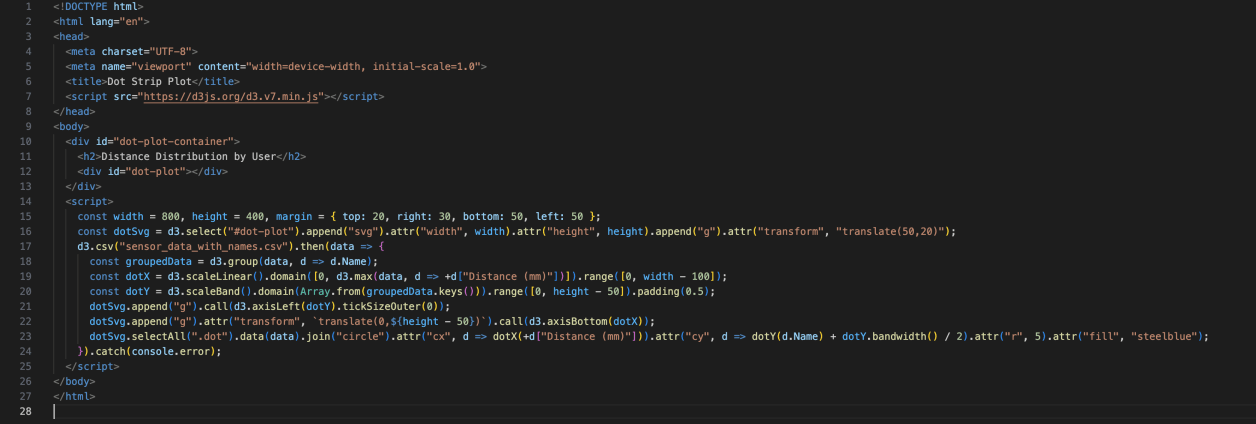
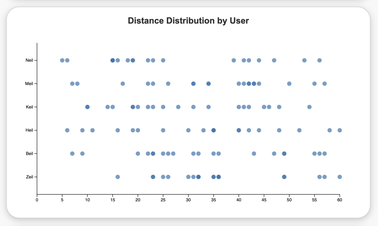
The second code is mapping out the distance distribution by user in a dot strip chart format. To make it more interactive, the user's data details will be highlighted once the mouse stops on it.
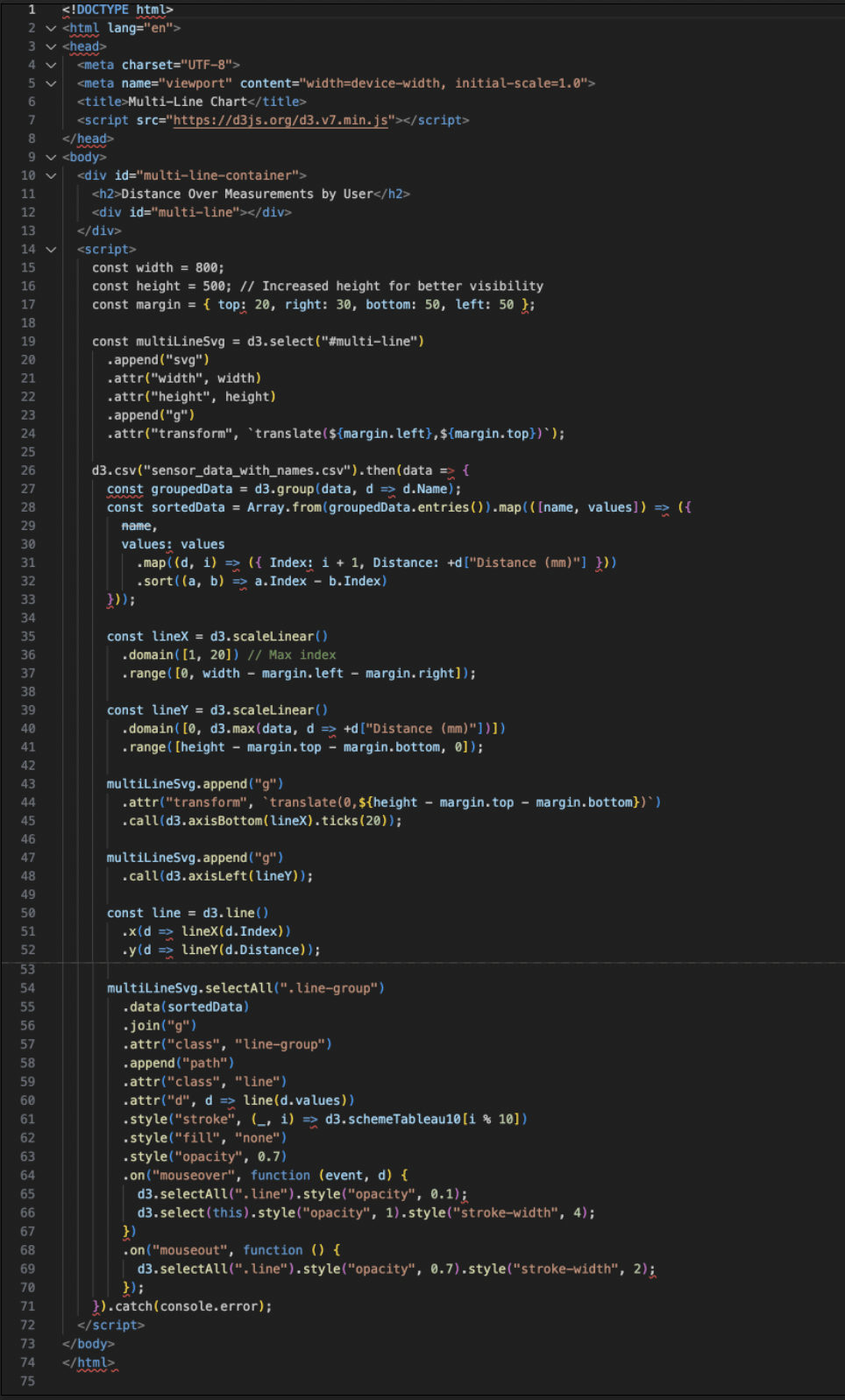
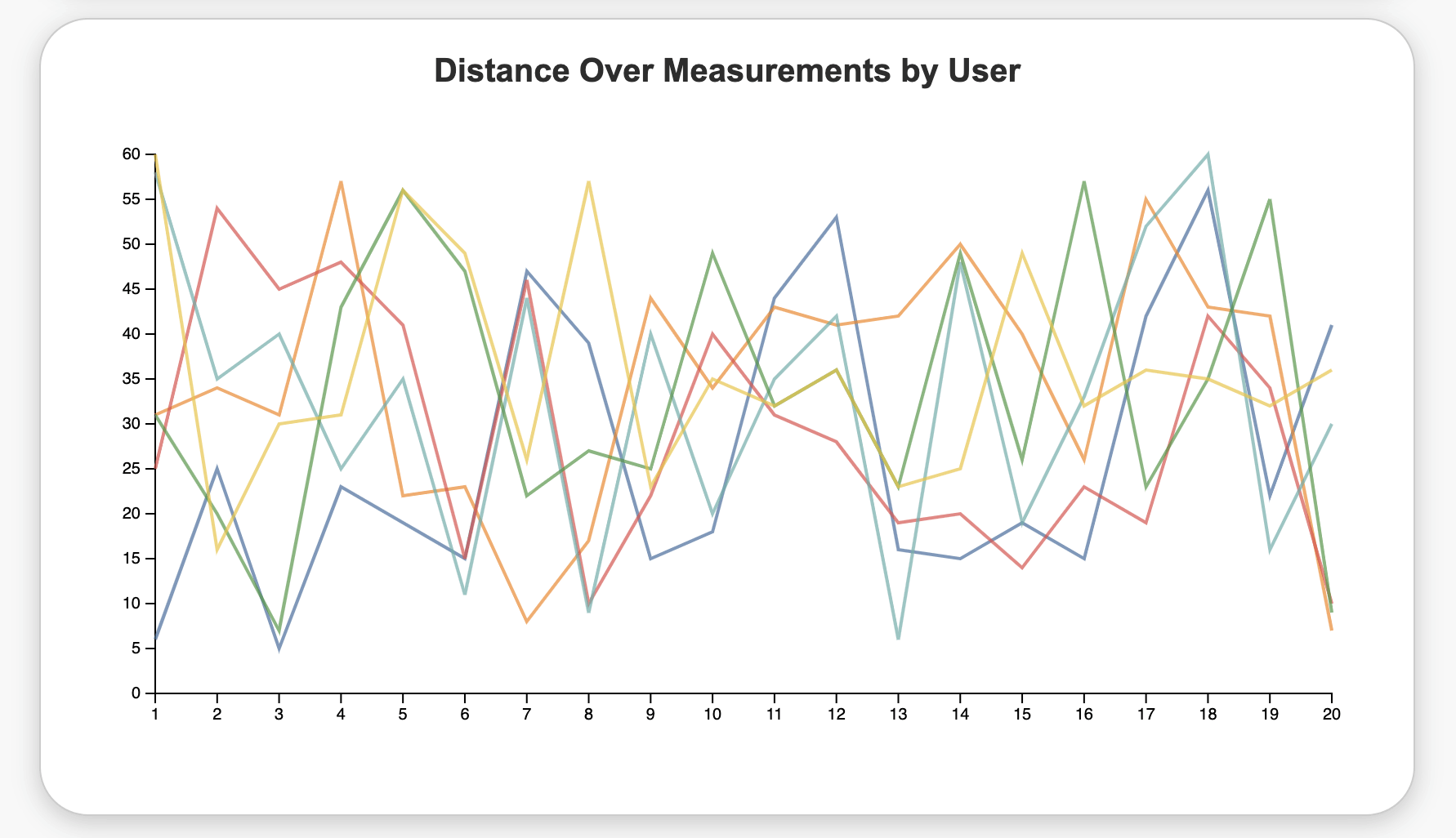
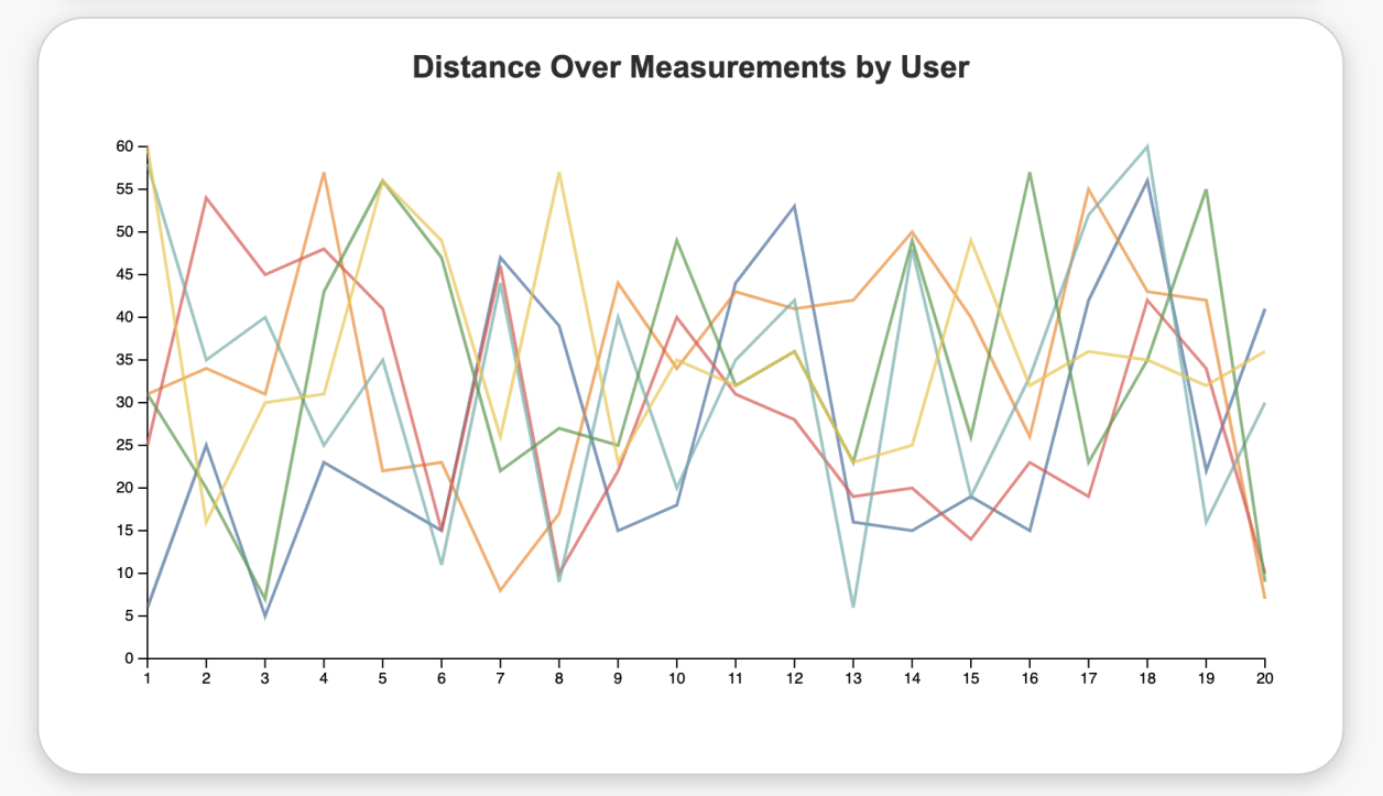
The third code aims to juxtapose each data curve in the same table to further find the relationship between them. From the multi-line chart, we can observe the distance and time (every one sec) clearly, and it's even easier to compare when I added a highlight function in the code. When the mouse stops on the curve, it will be highlighted and reveal more details.
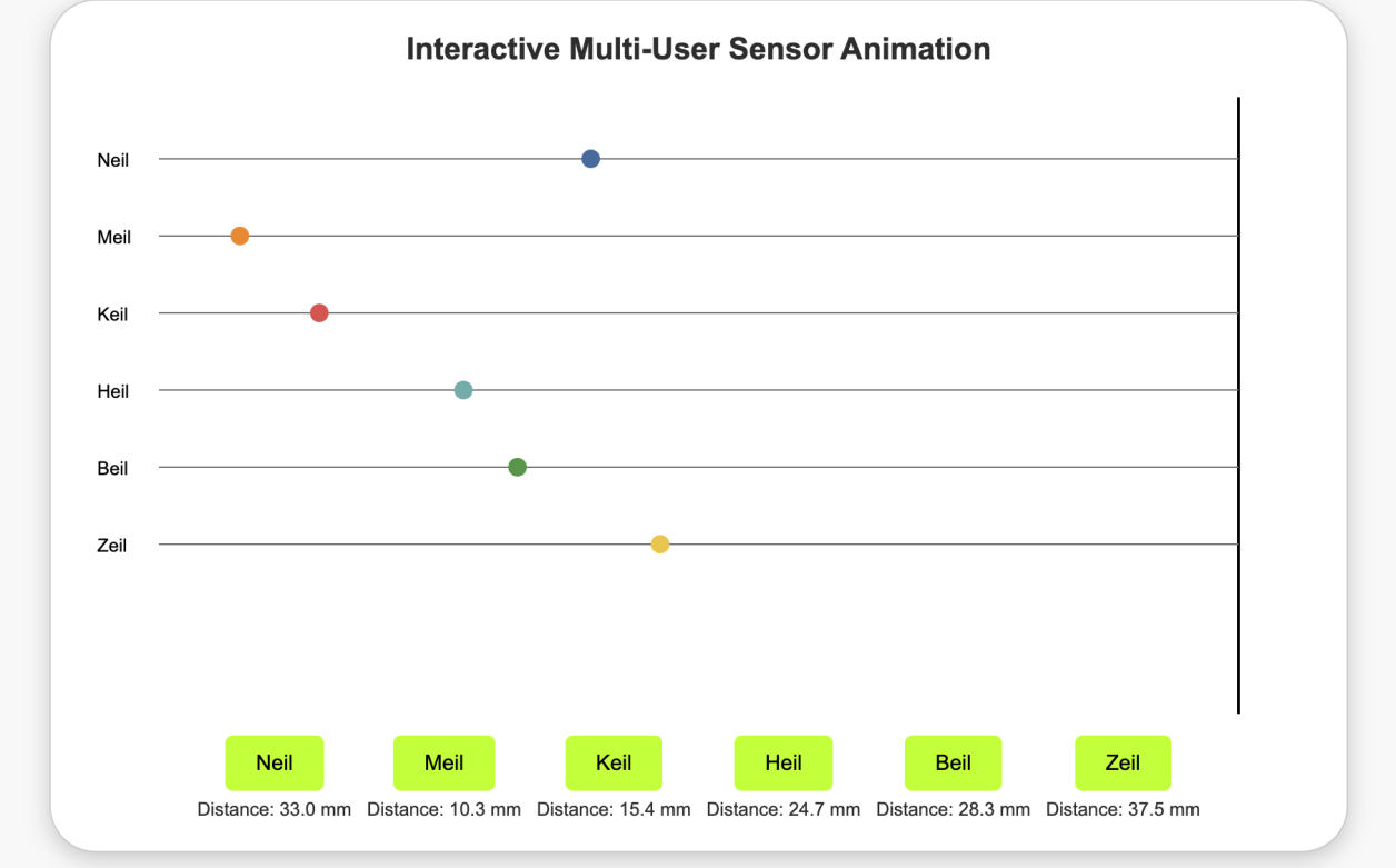
The last chart, which is my favorite, tries to simulate the actual motion from the user in reality. Based on the time and distance data, the code tries to predict the relationship between the user (color dots), and the sensor (const black line).
It's even cooler to compare multiuser's motion together by pushing all the button!

Drag and Drop Website Builder